
Web interface
Redesign of Heroma’s web interface, focused on improving
usability, modernizing the visual design, and creating a
scalable design system.
UX design
UI design
Context
Following the success of previous updated mobile app design,
the goal was to bring the same visual direction and usability
improvements to the existing web application.
The scope was focused on improving the interface and
user experience, without changing the underlying functionality.
This required balancing modern design principles with
existing system constraints.
The problem
The existing interface was outdated and difficult to navigate.
• The navigation was cluttered and unclear
• The interface lacked visual hierarchy
• Important functionality was hard to find
Users relied on workarounds rather than the intended navigation,
indicating a mismatch between design and real usage.
My role
UX designer
Responsible for interface design, navigation redesign,
and creating a scalable design system.
Process
Design foundation
I established a design foundation based on Material Design
principles, adapting them to fit Heroma’s needs and brand.
Navigation redesign
Navigation was identified as a key issue and prioritized early.
The goal was to create a more intuitive, space-efficient,
and accessible navigation experience.
Design system
Alongside the interface redesign, I developed a component
library and design guidelines to ensure consistency across
the application.
User testing
I validated the design through both digital and in-person
focus groups, observing real user behavior in context.
Key insights
• Users rarely used navigation as intended
• Search was underutilized due to low visibility
• Users relied on familiar patterns and shortcuts
• Observing real behavior revealed gaps in assumptions
Problem framing
The challenge was not to add new functionality,
but to align the interface with how users expect to interact
with the system.
Improving clarity and interaction patterns would have a
greater impact than increasing feature complexity.
Solution
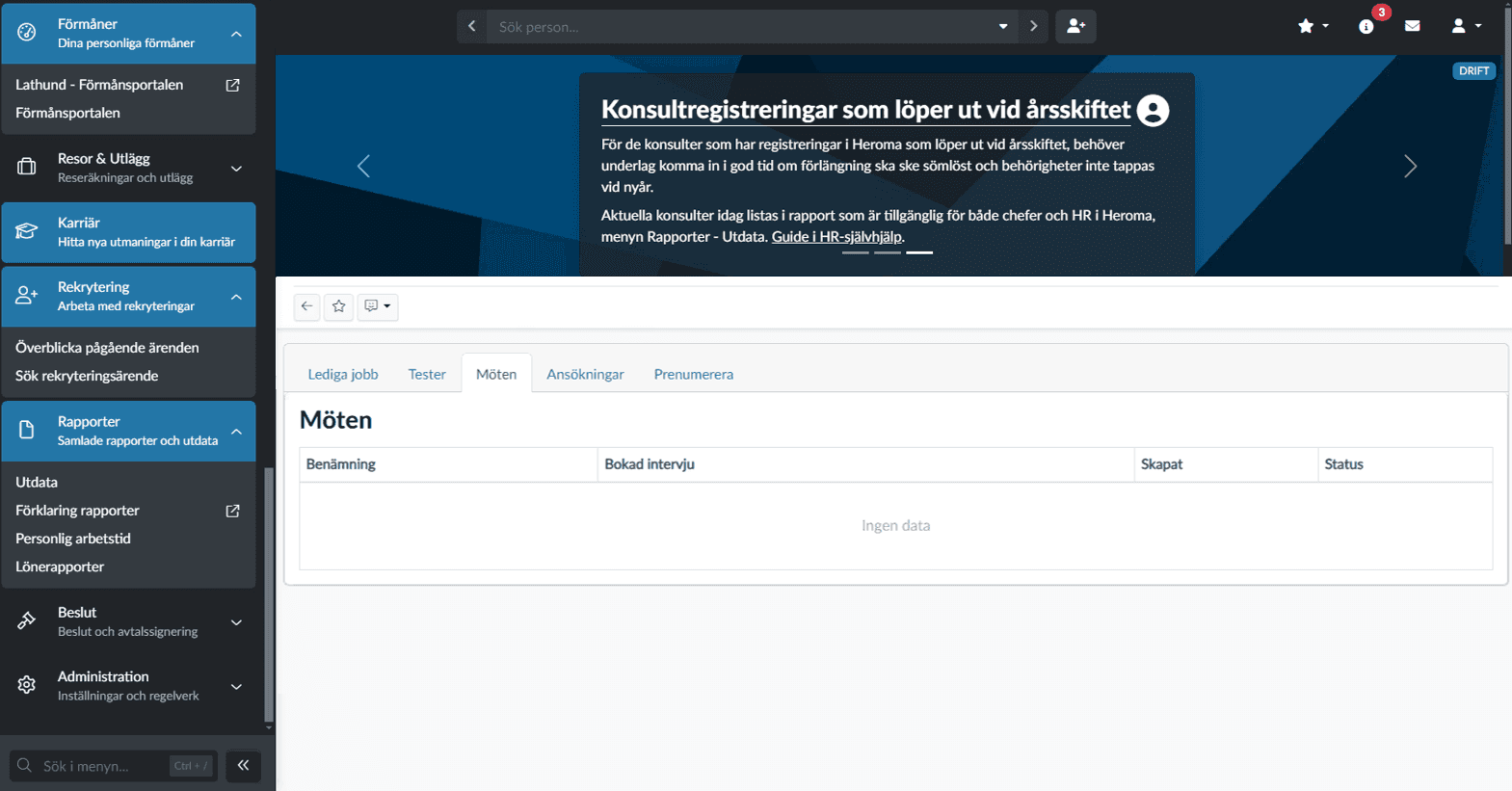
Before
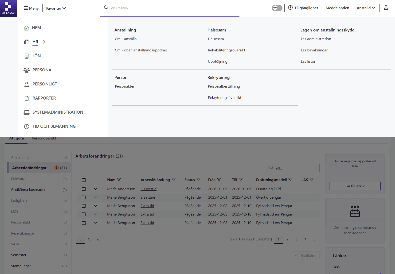
After
Key improvements
Improved navigation structure
Simplified and reorganized the navigation to create a clearer and more predictable structure.
Reduced visual clutter
Removed unnecessary elements and refined the layout to improve clarity.
Stronger visual hierarchy
Introduced clearer headings, spacing, and grouping of elements.
Impact
Faster navigation
Users find functionality more quickly.
Reduced cognitive load
Cleaner layout improves focus.
Improved consistency
Unified design system supports usability.
Design thinking
By simplifying the structure and strengthening the visual hierarchy, users can more easily find functionality and understand how to interact with the system. The approach prioritized reducing cognitive load and aligning the interface with real user workflows, rather than adding new features.
Outcome
• Improved navigation usability
• Increased use of search functionality
• More consistent user experience
• Positive feedback from users
The new interface is now live and used by all customers.
Reflection
This project highlighted the importance of validating
navigation design through real user behavior.
Initial assumptions about how users interact with the
interface did not match reality.
By observing users in their actual work environment,
it became clear that simplifying navigation and improving
discoverability had a greater impact than visual changes alone.
It reinforced the value of early testing, multiple design
iterations, and grounding decisions in real usage patterns.