
Transformation of an existing Heroma module into a mobile
application, focused on simplifying workflows and creating
a clear, user-friendly experience for smaller screens.
UX design
UI design
Mobile
Accessibility
Context
The project focused on transforming an existing web-based
module into a mobile application.
The goal was to maintain core functionality while adapting
the experience to mobile constraints, including smaller
screens, touch interaction, and on-the-go usage.
This required rethinking both structure and interaction,
not just scaling down the existing interface.
The problem
The existing module was not designed for mobile use.
• Complex workflows were difficult to navigate
• Information density was too high
• Interaction patterns were not suited for touch
Users lacked a clear overview and struggled to complete
tasks efficiently on smaller screens.
My role
UX designer
Focused on adapting workflows, simplifying interaction,
and designing a mobile-friendly interface.
Process
Understanding the current system
I reviewed existing requirements and analyzed the current
functionality to identify what should be
adapted, simplified, or removed.
Simplification
I reduced unnecessary elements, such as redundant icons
and excessive information, to improve clarity and focus.
Design foundation
The design was built using Ionic framework components,
ensuring a native-like experience while supporting
efficient development.
Iteration and validation
Although formal user testing was limited, I validated
flows with stakeholders and conducted internal testing
to refine the solution.
Key insights
• Mobile requires prioritization over completeness
• Reducing visual noise improves usability
• Clear hierarchy is critical on smaller screens
• Progressive disclosure simplifies complex workflows
Problem framing
The challenge was not to replicate the desktop experience,
but to redesign it for mobile use.
This required prioritizing essential functionality and
presenting it in a way that supports quick, focused interaction.
Solution
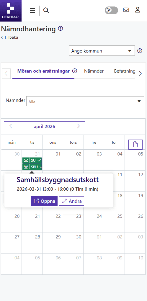
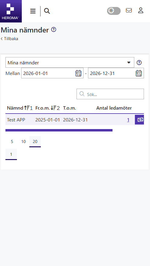
Before
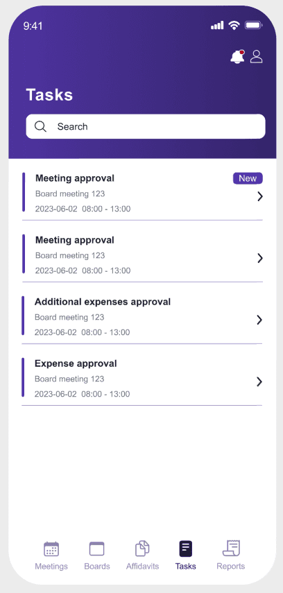
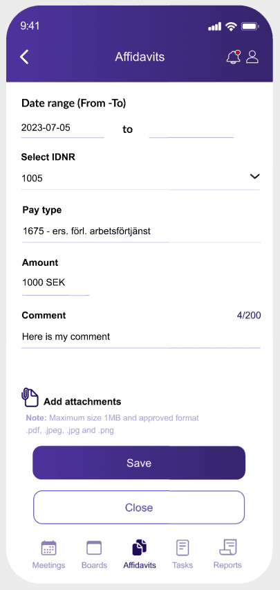
After
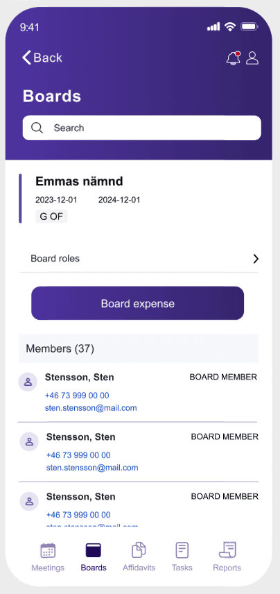
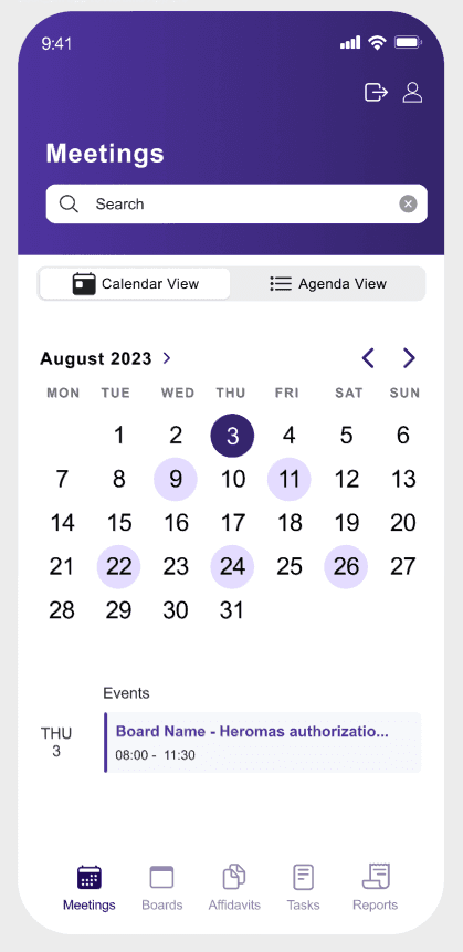
Key improvements
Mobile-first design
Redesigned the interface specifically for mobile, ensuring layouts, interactions, and content are optimized for smaller screens.
Simplified navigation
Introduced a clear bottom navigation and structured views (calendar, boards, tasks) to make it easier to move through the app.
Reduced complexity
Removed unnecessary elements and simplified workflows to better support quick, on-the-go interactions.
Impact
Better mobile usability
Optimized for real mobile usage.
Faster interactions
Simplified flows reduce effort.
Improved clarity
Cleaner layout supports quick scanning.
Design thinking
By simplifying the structure and reducing cognitive load, the interface better supports quick interactions and real user behavior on mobile devices. The goal was to prioritize clarity, efficiency, and ease of navigation rather than replicating the full desktop experience.
Outcome
• Improved usability on mobile devices
• Clearer workflows and interaction patterns
• Reduced cognitive load
• More accessible and user-friendly experience
The solution provided a strong foundation for further
development and iteration.
Reflection
This project highlighted the importance of designing
specifically for mobile, rather than adapting desktop
solutions.
Simplifying workflows and reducing information density
had a significant impact on usability.
Given more time, direct user testing would have provided
additional insights, but the process reinforced the value
of prioritization and clarity when working with constrained
interfaces.