
External web
Redesign of Heroma’s external web platform into a standalone
application, focused on improving usability, structure, and
overall user experience.
UX Redesign
UI design
WCAG
Accessibility
Web app
Context
Heroma’s external web platform is used by clients to manage
vacancies, educational opportunities, and other external-facing
content.
The existing solution was part of a larger system, making it
complex and less intuitive to use.
The goal was to redesign the platform into a standalone
application, aligned with Heroma’s design system while
improving usability and workflow clarity.
The problem
The existing experience lacked clarity and intuitive interaction.
• Key actions were not aligned with user expectations
• Navigation required unnecessary steps
• The interface lacked clear affordances
This created friction in simple workflows and made the system
harder to use, especially for new users.
My role
UX designer
Responsible for research, interaction design,
and translating user needs into a functional solution.
Process
Understanding the current system
I explored the existing module through hands-on use and
collaboration with Product Owners and developers to
understand functionality and usage.
User ingsights
I gathered input from users and stakeholders to identify
pain points, missing functionality, and opportunities
for improvement.
Design and iteration
Based on these insights, I created sketches and prototypes,
continuously validating ideas with stakeholders and refining
the solution through iteration.
User testing
Due to limited access to end users, I conducted usability
testing with colleagues using task-based scenarios.
This provided valuable insights into interaction patterns
and usability issues.
Key insights
• Users expect direct interaction with visible elements
• Navigation should match user mental models
• Clear affordances reduce hesitation and errors
• Small interaction changes can significantly improve usability
Problem framing
The challenge was not to add new functionality,
but to align the interface with how users expect to interact
with the system.
Improving clarity and interaction patterns would have a
greater impact than increasing feature complexity.
Solution
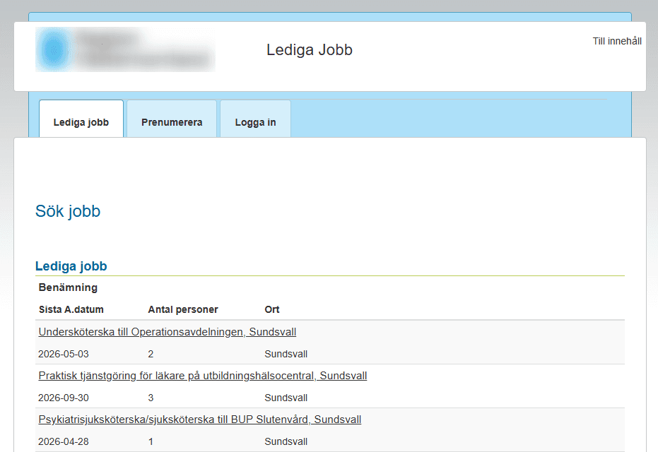
Before
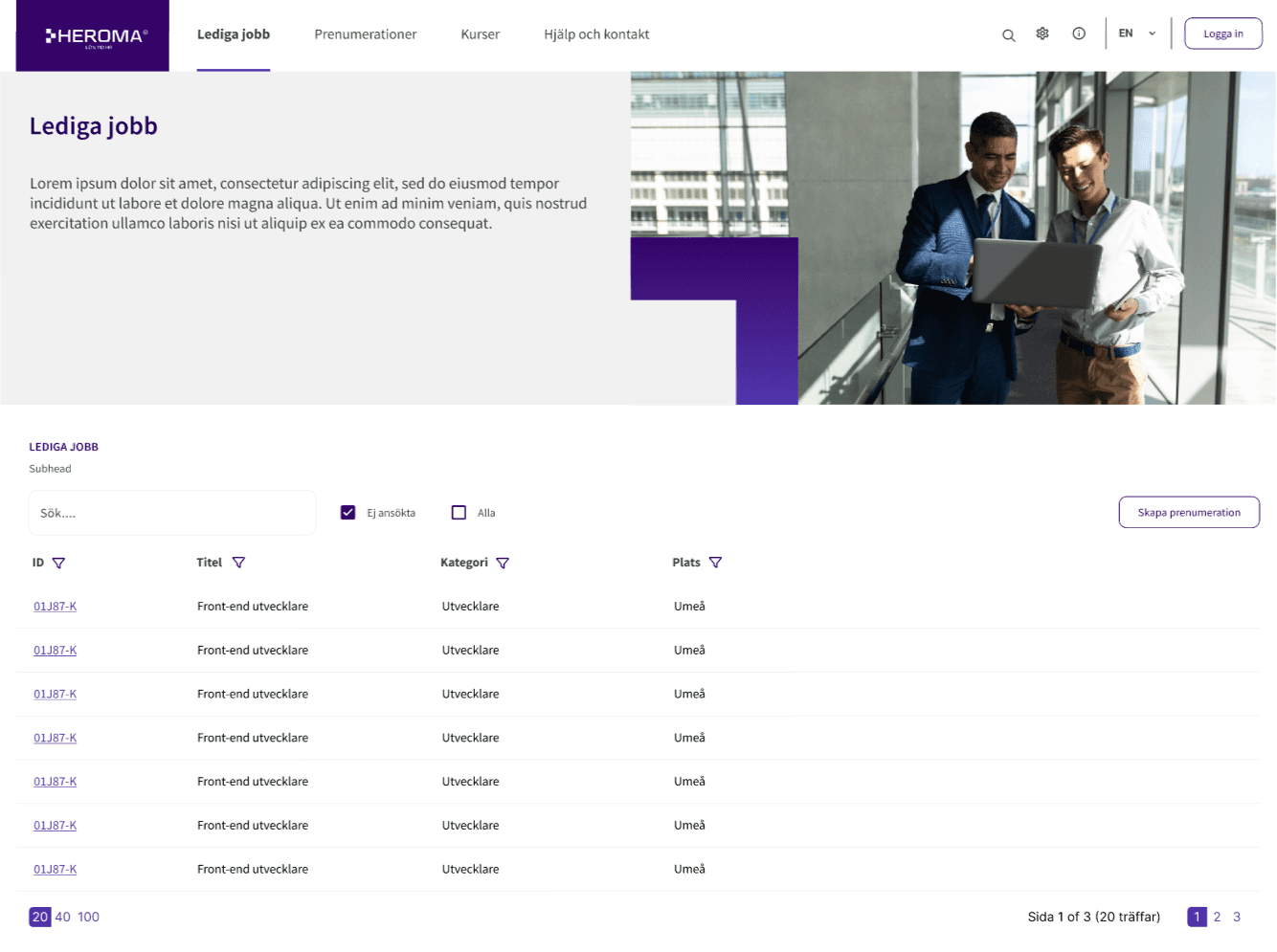
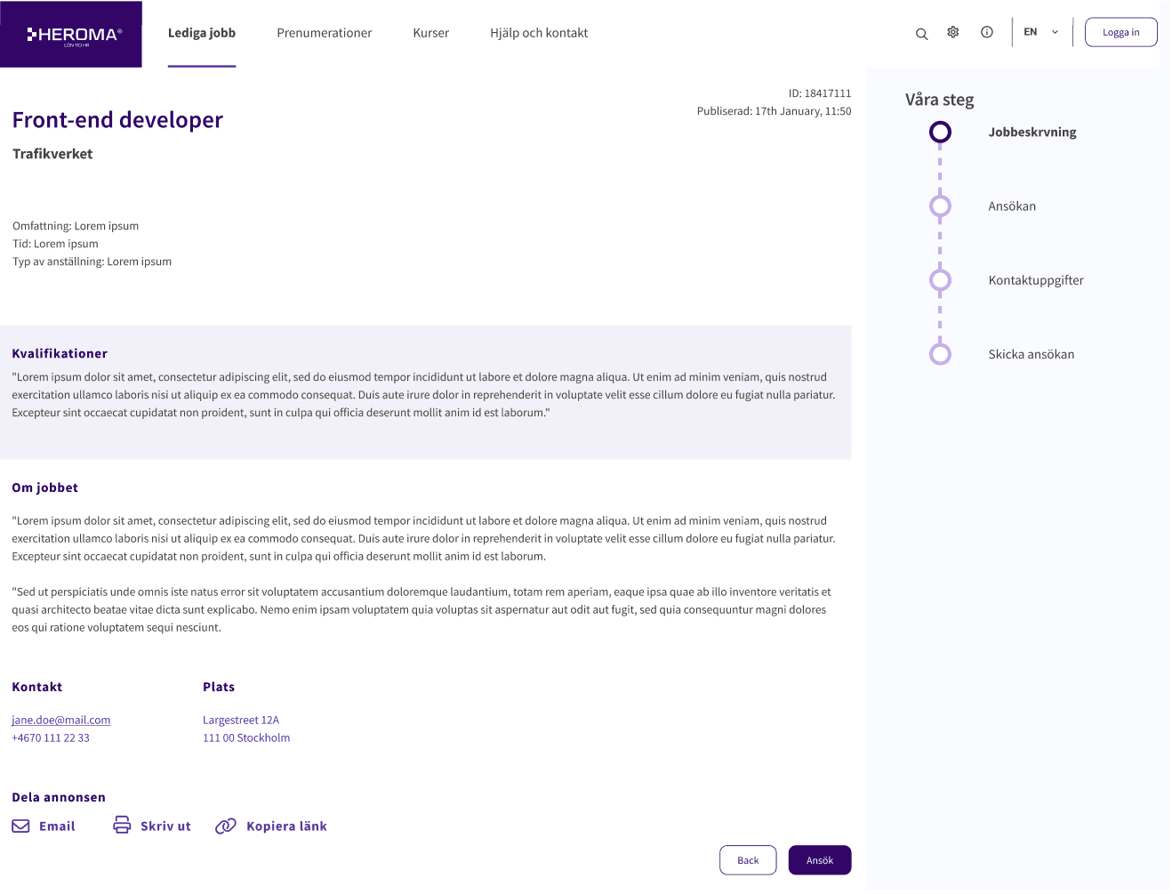
After
Key improvements
Improved search and filtering
Introduced a clear and accessible search bar along with filtering options to help users quickly find relevant job opportunities.
Clear information hierarchy
Reorganized job listings to highlight key information such as role, location, deadline, and number of applicants.
Reduced cognitive load
Simplified the layout with improved spacing, clearer grouping, and reduced visual clutter.
Impact
Faster job discovery
Users can quickly identify relevant listings.
Improved usability
Cleaner layout reduces friction.
Higher engagement
Clear actions support continued interaction.
Design thinking
The redesign focused on reducing cognitive load and improving scanability. By restructuring the layout and highlighting key information such as role, location, and deadlines, the interface better supports how users naturally browse job listings.
The result is a clearer, more intuitive experience that enables faster decision-making and encourages continued engagement.
Outcome
• Improved usability and interaction clarity
• Reduced user hesitation and errors
• More intuitive workflows
• Positive early feedback from users
The redesigned application is currently being implemented
across multiple customers, with ongoing validation.
Reflection
This project highlighted the importance of involving real users
in the design process.
Due to limited access, I adapted by testing with colleagues,
which still provided valuable directional insights.
However, direct user validation would have strengthened
the outcome further.
It reinforced the importance of defining core use cases early
and maintaining focus on essential functionality,
rather than allowing the scope to expand.