
Travel site
Design of a flight booking experience focused on improving
usability, reducing friction, and creating a more intuitive
user journey.
UX design
UI design
Context
This project was part of my UX Design Institute training,
where I worked with a fictional airline client.
The goal was to redesign the flight booking experience,
focusing on usability and reducing friction across the
user journey.
The project followed a structured UX process, from
initial research to final prototype.
The problem
The existing flight booking experience contained multiple
points of friction.
• Unclear flow between steps
• Poor overview of booking details
• Redundant steps and interruptions
These issues made the process confusing and less efficient
for users.
My role
UX designer
Responsible for research, interaction design,
and building the final prototype.
Process
Research
I conducted surveys and usability testing to understand
user behavior and identify key pain points.
Benchmarking
I analyzed competing airline websites to identify both
successful patterns and common issues.
Analysis
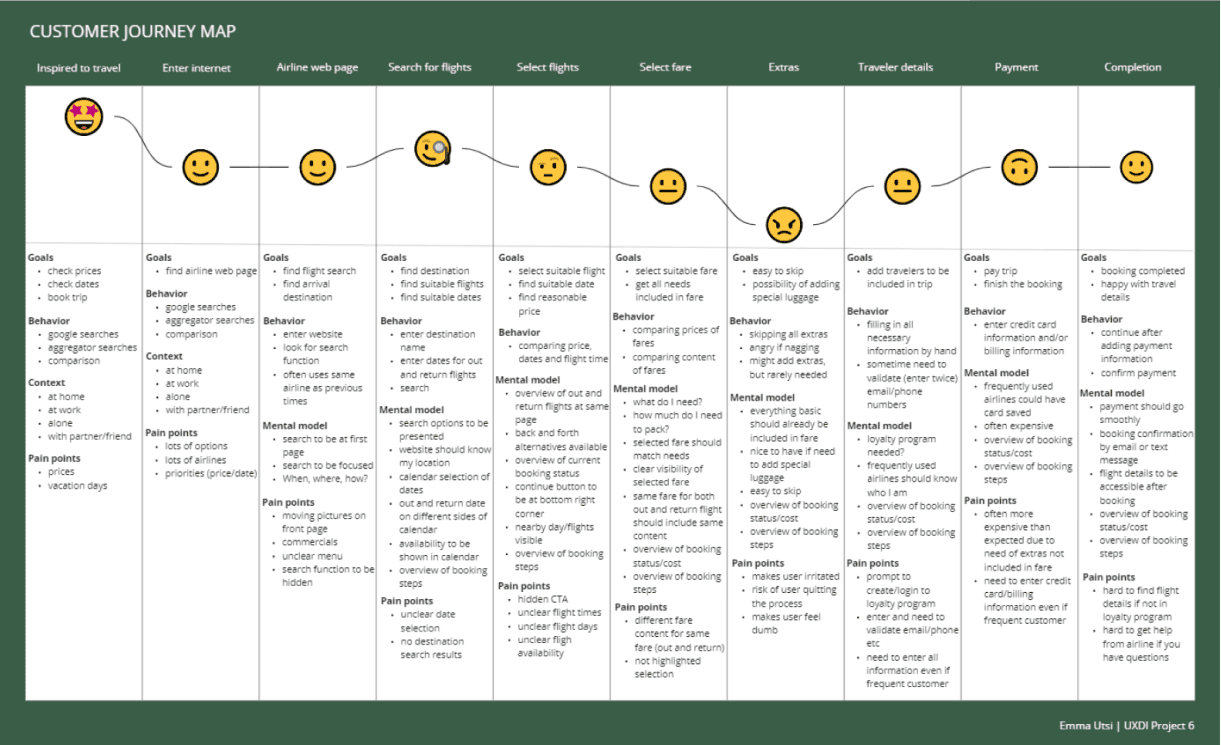
I organized insights using affinity diagrams and
customer journey mapping to structure the problem space.
Design
Based on these insights, I developed wireframes,
interaction flows, and a prototype.
Key insights
• Booking flows often include unnecessary steps
• Users need a clear overview throughout the process
• Unexpected interruptions create frustration
• Simplicity and clarity improve completion rates
Problem framing
The challenge was to create a booking experience that is
clear, efficient, and predictable.
Reducing friction and improving flow would have a greater
impact than adding new features.
Solution
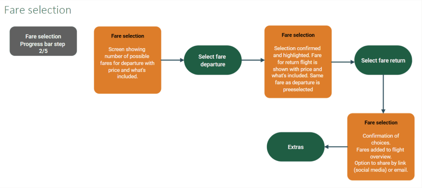
Example of user flow
Customer journey
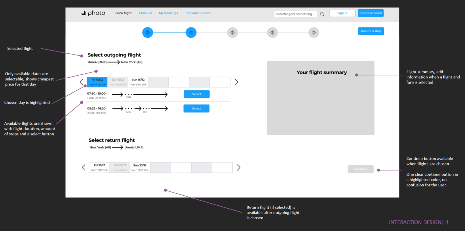
Wireframe
Prototype screen

Key improvements
Improved booking flow
Redesigned the booking process to reduce friction and guide users step-by-step through the journey.
Clear structure and navigation
Simplified the overall structure to make it easier for users to understand where they are and what to do next.
Reduced cognitive load
Eliminated unnecessary steps and information, allowing users to focus on completing their booking efficiently.
Enhanced overview and transparency
Improved visibility of key information such as pricing, selections, and progress throughout the booking process.
Streamlined interactions
Optimized interactions to reduce the number of clicks and improve flow between steps.
Data-driven design decisions
Used insights from user research and usability testing to inform design choices and validate solutions.
Impact
Simpler booking process
Users complete tasks with less effort.
Improved clarity
Better overview of steps and selections.
Reduced friction
Fewer errors and interruptions.
Design thinking
By identifying pain points through research and testing, the solution prioritizes clarity, guidance, and efficiency. The goal was to reduce friction and support users in completing their booking with confidence.
Outcome
• Improved clarity and flow
• Reduced friction in the booking process
• More intuitive user experience
• Positive feedback during usability testing
The final prototype demonstrated a more efficient and
user-friendly booking experience.
Reflection
This project reinforced the importance of understanding
user behavior through research and observation.
While initial assumptions suggested certain improvements,
user testing revealed different priorities and pain points.
It highlighted the value of iterative design and being
open to adjusting solutions based on real user feedback.